由于用vscode写html会会频繁的用大注释,这里写一下
VScode注释
注释: 先CTRL+K,然后CTRL+C
取消注释: 先CTRL+K,然后CTRL+U
HTML+CSS+JavaScript
结构+表现+交互
什么是CSS
1.css是什么
2.CSS怎么用(快速入门)
3.CSS选择器(重点+难点)
4.美化网页(文字,阴影,超链接,列表,渐变)
5.盒子模型
6.浮动
7.定位
8.网页动画(特效效果)
什么是CSS
Csacading style sheet 层叠级联样式表
CSS:表现(美化网页)
字体,颜色,编剧,高度,宽度,背景图片,网业定位,网页浮动。。。
CSS发展史
CSS1.0
CSS2.0 DIV(块)+CSS , html与css结构分离的思想,网页变得简单
CSS2.1 浮动,定位
CSS3.0 圆角边框,阴影能够,动画。。。浏览器兼容
html和css样式
<!DOCTYPE html>
<html lang="en">
<head>
    <meta charset="UTF-8">
    <title>Title</title>
    <!--
    规范,<style> 可以编写css代码,每一个声明最好使用;结尾
    选择器{
        声明1;
        声明2:
        声明3;
    }

    -->
    <link rel="stylesheet" href="css/style.css">
    <!--
    建议使用这种规范
    1.内容与表现分离
    2.网页结构表现统一,可以实现复用
    3.样式十分丰富
    4.建议使用独立于htnl的css文件
    5.利用SEO,容易被搜索引擎收入!
    -->

    <!--内部样式-->
    <style>
    /*css中用这个注释*/
    h2{
        color:yellow;
    }
    @import url("css/style.css");
    </style>


</head>
<body>
<h1>我是标题</h1>


<!--导入css的几种方式-->
<!--优先级:就近原则,谁离标签近显示谁的颜色,外部css如果link离标签比内部样式近的话,就用外部css,最近的是行内样式-->
<!--在行内标签中编写样式,编写一个style属性,编写样式,不建议-->
<h1 style="color : blue">我是标题</h1>
<!--内部样式,在header里写style,然后用选择器定位-->
<h2>我是标题</h2>
<!--外部样式,在文件外写css样式然后用,link引入-->
<h3>外部样式</h3>
<!--外部样式拓展,两种写法-->
<!--一种是link,一种是@  @的缺点是:网页较大的情况下会先展示骨架子,在变得好看 而link不是这样的   @是css2.1特有的!-->
<h4>@样式</h4>


</body>
</html>
h1{
   color:red;
}
h3{
   color:green;
}
h4{
   color:black;
}
选择器
类选择器:选择所有class属性一致的标签,可跨标签,类名{}
标签选择器:选择一类标签,标签{}
id选择器:全局唯一不能重复!#id名{}
类选择器
<!DOCTYPE html>
<html lang="en">
<head>
    <meta charset="UTF-8">
    <title>Title</title>
    <style>
        /*类选择器的格式,.class的名称{}*/
        .first{
        color:red;
        }
        .second{
        color:green;
        }
    </style>
</head>
<body>
<h1 class="first">第一个</h1>
<h1 class="second">第二个</h1>
<h1>第三个</h1>
</body>
</html>
标签选择器
<!DOCTYPE html>
<html lang="en">
<head>
    <meta charset="UTF-8">
    <title>Title</title>
    <style>
    /*标签选择器会选中页面所有这个标签的元素*/
        h1{
        color:red;
        background:green;
        border-radius:24px;
        }
        p{
        font-size:80px;
        }
    </style>
</head>
<body>
<h1>选择器</h1>
<p>这是一个p</p>
<!--
选择器;
选择页面上的某一个或者某一类元素
基本选择器:
    标签选择器
    类 选择器 class
    id 选择器
-->
<!--
基本选择器:
1.标签选择器
2.类选择器 class
3.id 选择器
-->

</body>
</html>
id选择器
<!DOCTYPE html>
<html lang="en">
<head>
    <meta charset="UTF-8">
    <title>Title</title>
    <style>
        /*id选择器
        #id名称{}
        id要保证全局唯一
        不遵循就近原则
        id选择器 > class选择器 > 标签选择器
        */
        #first{
        color:red;
        }
        .op{
        color:blue;
        }
        #second{
        color:green;
        }
        h1{
        color:yellow;
        }
    </style>
</head>
<body>
<h1 class="op" id="first">第一个</h1>
<h1 class="op">第二个</h1>
<h1 id="second">第二个</h1>
<h1>第三个</h1>
</body>
</html>
层次选择器
后代选择器:在某个元素后面,某个标签下的标签用什么类型的css,祖父 爷爷 父亲 所有的有会改变
/*后代选择器*/
body p{
    background:red;
}
子选择器,一代,只会改变下一代,下下一代不会改变
/*子选择器*/
body>p{
    background:red;
}
相邻兄弟选择器,只会选择下面一个相同的标签去改变,自身不变。
/*相邻兄弟选择器,选择下面一个兄弟标签(同样的标签)*/
.active + p{
    background:blue;
}
通用选择器
/*通用选择器,选择当前元素向下的所有兄弟玄素,~后是要更改标签的标签,可以换成a之类的标签*/
.active~p{
    background :red;
}
结构伪类选择器
还可以做鼠标选中显示什么颜色之类的特效如:
a:hover{
    background:red;
}
/*鼠标浮上背景变红*/<!DOCTYPE html>
<html lang="en">
<head>
<meta charset="UTF-8">
<title>Title</title>
<!--避免使用标签,class和id-->
<style>
/*ul的第一个子元素*/
ul li:first-child{
background:red;
}
/*ul的最后一个子元素*/
ul li:last-child{
background:green;
}
/*选中p1 : 定位到父元素,选择当前第一个元素
选中当前p元素的父级元素,选中父级元素的第一个,并且是当前元素才生效也就是是p才生效,顺
序选择,如果顺序标签不是p则不会生效
*/
p:nth-child(1){
background:green;
}
/*选中父元素下的p元素的第二个,类型选择,如果第二个标签不是p则会顺序的向下找*/
p:nth-of-type(2){
background:yellow;
}
</style>
</head>
<body>
<p>p1</p>
<p>p2</p>
<p>p3</p>
<ul>
<li>
li1
</li>
<li>
li2
</li>
<li>
li3
</li>
</ul>
</body>
</html>属性选择器(常用)
id + class 结合
<!DOCTYPE html>
<html lang="en">
<head>
    <meta charset="UTF-8">
    <title>Title</title>
    <style>
    /*
    属性选择器支持正则表达式
    = 是等于
    *= 是包含
    ^= 匹配以什么开头的
    $= 以什么结尾的

    */
        .demo a{
            float:left;
            display:block;
            height:50px;
            width:50px;
            border-radius: 20px;
            background:blue;
            text-align:center;
            color:red;
            text-decoration:none;
            margin-right:5px;
            font:bold 20px/50px Arial;    /*字体粗细   字体大小/行高   字体*/

        }
        /* 属性名 ,属性名 = 属性值(正则) */
        /*存在id属性的元素   a[]{}*/
        /*
        a[id]{
            background:yellow;
        }*/
        /*id = first 的元素*/
        /*
        a[id=first]{
            background:red;
        }*/
        /*class 中有 links的元素*/
        /*
        a[class*="links"]{
            background:yellow;
        }*/
        /*选择 href 中以http开头的元素*/
        /*a[href^=http]{
            background:white;
        }*/
        /* 选中以pdf结尾的 */
        a[href$=pdf]{
            background:yellow;
        }


    </style>
</head>
<body>
<p class="demo">
    <a href="http://www.baidu.com" class="links item first" id="first">1</a>
    <a href="" class="links item active" target="_blank" title="test">2</a>
    <a href="images/123.html" class="links item">3</a>
    <a href="images/123.png" class="links item">4</a>
    <a href="images/123.jpg" class="links item">4</a>
    <a href="abc" class="links item">6</a>
    <a href="/a.pdf" class="links item">7</a>
    <a href="/abc.pdf" class="links item">8</a>
    <a href="abc,doc" class="links item">9</a>
    <a href="abcd.doc" class="links item last">10</a>

</p>
</body>
</html>
总结:
=  是等于
*=  是包含
^=  是以什么开头
$=  是以什么什么结尾
美化页面元素
为什么要美化网页
- 有效传递页面信息
- 美化网页,页面漂亮,才能吸引用户
- 凸显主题
- 提高用户的体验
span标签
重点要突出的字用span套起来
<!DOCTYPE html>
<html lang="en">
<head>
    <meta charset="UTF-8">
    <title>Title</title>
    <style>
        #lo{
            font-size: 50px;
        }
        #lp{
            font-size: 50px;
        }
    </style>
</head>
<body>
<!--些啥都可以,但是约定用span-->
我爱<span id="lo">java</span>
我爱<wewwewqeqw id="lp">java</wewwewqeqw>
</body>
</html>
字体样式
<!DOCTYPE html>
<html lang="en">
<head>
    <meta charset="UTF-8">
    <title>Title</title>
    <!--字体风格-->
    <style>
        p{
            font: oblique 800 30px "楷体" ;
        }
    </style>
</head>
<body>
<p>
    亿万用户提供高效稳定便捷的电子邮件服务。你可以在电脑网页、iOS/iPad客户端、及Android客户端上使用它,通过邮件发送3G的超大附件,体验文件中转站、日历、
</p>
</body>
</html><!DOCTYPE html>
<html lang="en">
<head>
<meta charset="UTF-8">
<title>Title</title>
<style>
#lo{
font-size: 50px;
}
#lp{
font-size: 50px;
}
/*
font-family 字体
font-size: 字体大小
font-weight 字体粗细
color 字体颜色
*/
body{
font-family:"Arial Black",楷体; /*可以设置两种字体一种英文一种中文*/
color: red;
}
h1{
font-size:50px; /* em 是缩进,px是大小*/
}
.p1{
font-weight:850; /*可以写成 font-weight: 800 这样,范围是0-900*/
}
</style>
</head>
<body>
<!--些啥都可以,但是约定用span-->
我爱<span id="lo">java</span>
我爱<wewwewqeqw id="lp">java</wewwewqeqw>
<h1>这是标题</h1>
<p class="p1">
亿万用户提供高效稳定便捷的电子邮件服务。你可以在电脑网页、iOS/iPad客户端、及Android客户端上使用它,通过邮件发送3G的超大附件,体验文件中转站、日历、
</p>
<p>
Give me the strength lightly to bear my joys and sorrows.Give me the strength to make my love fruitful in service.Give me the strength never to disown the poor or bend my knees before insolent might.Give me the strength to raise my mind high above daily trifles.And give me the strength to surrender my strength to thy will with love
</p>
</body>
</html>文本样式
- 颜色 color rgb rgba带透明度
- 文本对齐方式 text-align = center
- 首行缩进 text-indent: 2em
- 行高 line-height: 文本上下居中 行高=height line-height 和height 数值相同
- 装饰 text-decoration 下划线
- 文本图片水平对齐 vertical-align:middle
<!DOCTYPE html>
<html lang="en">
<head>
    <meta charset="UTF-8">
    <title>Title</title>
    <!--
        颜色:
           单词
           RGB  0-F
           RGBA  0-255   透明度0-1
        text-align: center;  排版,居中
        text-indent: 2em;   首行缩进,em代表字符
        行高  和 块 的高度一致,就可以上下居中
     -->
    <style>

        h1{
            color: rgba(0, 255, 255, 0.5);
            text-align: center;
        }
        .p1{
            text-indent: 2em;
        }
        .p3{
            background: blue;
            height: 300px;
            line-height: 300px;
        }
        /* 下划线 */
        .l1{
            text-decoration: underline;
        }
        /* 中划线 */
        .l2{
            text-decoration: line-through;
        }
        /* 上划线 */
        .l3{
            text-decoration: overline;
        }
        /* 水平对齐~ 参照物 ,a,b */
        img,span{
            vertical-align: middle;
        }
    </style>

</head>
<body>
<p class="op">
    <img src="./123.jpg" alt=""/>
    <span>sdadsasasda</span>
</p>
<p class="l1">wqeqwwqeq</p>
<p class="l2">wqeqwwqeq</p>
<p class="l3">wqeqwwqeq</p>

<h1>这是标题</h1>
<p class="p1">
    亿万用户提供高效稳定便捷的电子邮件服务。你可以在电脑网页、iOS/iPad客户端、及Android客户端上使用它,通过邮件发送3G的超大附件,体验文件中转站、日历、
</p>
<p class="p3">
    Give me the strength lightly to bear my joys and sorrows.Give me the strength to make my love fruitful in service.Give me the strength never to disown the poor or bend my knees before insolent might.Give me the strength to raise my mind high above daily trifles.And give me the strength to surrender my strength to thy will with love
</p>
</body>
</html>
超链接伪类,阴影鼠标按住悬浮点击等的状态
正常情况下,a,a:hover用最多,鼠标悬浮状态
<!DOCTYPE html>
<html lang="en">
<head>
    <meta charset="UTF-8">
    <title>Title</title>
    <!--
        颜色:
           单词
           RGB  0-F
           RGBA  0-255   透明度0-1
        text-align: center;  排版,居中
        text-indent: 2em;   首行缩进,em代表字符
        行高  和 块 的高度一致,就可以上下居中
     -->
    <style>
        /* 初始默认的颜色 */
        a{
            text-decoration: none;
            color: black;
        }
        /* 鼠标悬浮的状态 */
        a:hover{
            color: orange;
            font-size: 50px;
        }
        /* 鼠标按住为释放的状态 */
        a:active{
            color: rebeccapurple;
        }
        /* 访问后的链接状态,link为未访问状态 */
        a:visited{
            color: green;
        }
        /* 第一个参数为阴影的颜色,第二个参数水平偏移,第三个参数垂直偏移,(上为正,右为正,负数为下,左边为负数),第四个参数阴影半径 */
        #price{
            text-shadow: blueviolet 10px 10px 2px;
        }
    </style>

</head>
<body>

<a href="#">
    <img src="./123.jpg" alt="">
</a>
<p>
    <a href="#">这是名字:名字啦!!</a>
</p>
<p>
    <a href="#">作者:作者名字</a>
</p>
<p id="price">
    ¥999
</p>

</body>
</html>
列表
#nav{
    width: 300px;
    background: orchid;
}
.title{
    font-size: 18px;
    font-weight: bold;
    text-indent: 1em;
    line-height: 35px;
    background: red;
}
/*

list-style:
 none  去掉原点
 circle  空心圆
 decimal  数字
 square  正方形
*/
ul{
    background: gray;
}
ul li{
    height: 30px;
    list-style: none;

}
a{
    text-decoration: none;
    font-size: 14px;
    color: black;
}
a:hover{
    color: orange;
    text-decoration: underline;
}
<!DOCTYPE html>
<html lang="en">
<head>
<meta charset="UTF-8">
<title>Title</title>
<link rel="stylesheet" href="liebiao.css" type="text/css"/>
</head>
<body>
<div id="nav">
<h2>全部商品分类</h2>
<ul>
<li>
<a href="#">图书</a> <a href="#">隐形</a> <a href="#">拉拉</a>
</li>
<li><a href="#">图书</a> <a href="#">隐形</a> <a href="#">拉拉</a></li>
<li><a href="#">图书</a> <a href="#">隐形</a> <a href="#">拉拉</a></li>
</ul>
</div>
</body>
</html>背景
背景颜色
背景图片
背景图片
<!DOCTYPE html>
<html lang="en">
<head>
    <meta charset="UTF-8">
    <title>Title</title>
    <!--
        border   边框粗细    边框样式   边框颜色

     -->
    <style>
        div{
            width: 1000px;
            height: 700px;
            border: 1px solid red;
            background-image: url("123.jpg");
            /*
            背景图片,默认全部平铺得
             */
        }
        .div1{
            background-repeat: repeat-x;
            /* 背景图片,水平平铺 */
        }
        .div2{
            background-repeat: repeat-y;
            /* 背景图片,水平平铺 */
        }
        .div3{
            background-repeat: no-repeat;
            /* 不平铺 */
        }
    </style>


</head>
<body>
    <div class="div1">

    </div>
    <div class="div2">

    </div>
    <div class="div3">

    </div>

</body>
</html>.title{
font-size: 18px;
font-weight: bold;
text-indent: 1em;
line-height: 35px;
/* 颜色 图片 横坐标 纵坐标 平铺方式 */
background: red url("./123.jpg") 270px 10px no-repeat;
}
/*
list-style:
none 去掉原点
circle 空心圆
decimal 数字
square 正方形
*/
ul{
background: gray;
}
ul li{
height: 30px;
list-style: none;
background-image: url("./123.jpg");
background-repeat: no-repeat;
background-position: 236px 2px;
}背景颜色
渐变
background-image: linear-gradient(43deg, #4158D0 0%, #C850C0 46%, #FFCC70 100%);盒子模型
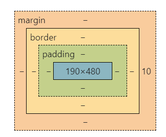
margin 外边距
padding 内边距
border 边框
边框
border
<!DOCTYPE html>
<html lang="en">
<head>
    <meta charset="UTF-8">
    <title>Title</title>
    <!-- 径向渐变  圆形渐变 -->
    <style>
        /* body会有一个自动的外边距,将他设为0 */
        body{
            margin: 0;
        }
        /* border :粗细,样式,颜色 */
        #box{
            width: 300px;
            height: 200px;
            margin: 10px 10px 10px 10px;
            border: 1px solid red;

        }
        h2{
            font-size: 16px;
            background: greenyellow;
            margin: 0;
            color: honeydew;
            text-align: center;
        }
        form{
            background: greenyellow;
            width: 300px;
            height: 200px;
        }
        span{
            margin-top: 12px;
            float: left;
            margin-left: 30px;
        }
        div:nth-of-type(1) input{
            float: right;
            margin-right: 20px;
            margin-top: 10px;
            border: 3px solid black;
        }
        div:nth-of-type(2) input{
            float: right;
            border: 3px dashed rebeccapurple;
        }
        div:nth-of-type(3) input{

            border: 3px solid black;
        }
    </style>

</head>
<body>
    <div id="box">
        <h2>会员登录</h2>
        <form action="#">
            <div>
                <span>用户名:</span>
                <input type="text">
            </div>
            <div>
                <span>密码:</span>
                <input type="text">
            </div>
            <div>
                <span>邮箱:</span>
                <input type="text">
            </div>
        </form>
    </div>


</body>
</html>
margin : 0 1 2 3
margin 参数 与 位置
(1个上下左右;2个:上下+左右;3个:上+左右+下)
上右下左
auto自动居中
padding 和 margin 类似圆角边框
4个角
/* 左上  右上  右下   左下  顺时针方向 */
/* 圆圈   圆角  =  半径 */
#box{
    width: 100px;
    height: 50px;
    margin: 10px auto;
    background: red;
    border-radius: 50px 50px 0px 0px;
}
盒子阴影
box-shadow: h-shadow v-shadow blur spread color inset;| 值 | 说明 |
|---|---|
| h-shadow | 必需的。水平阴影的位置。允许负值 |
| v-shadow | 必需的。垂直阴影的位置。允许负值 |
| blur | 可选。模糊距离 |
| spread | 可选。阴影的大小 |
| color | 可选。阴影的颜色。在CSS颜色值寻找颜色值的完整列表 |
| inset | 可选。从外层的阴影(开始时)改变阴影内侧阴影 |
居中:要求外边的盒子是一个块元素,并且有固定的宽和高。
浮动
块级元素:独占一行
h1~h6 p div 列表。。。行内元素:不独占一行
span a img strong。。。行内元素可以包含在块级元素中,反之,则不可以
浮动
float 飘在块上边 在css中加入clear:both 可以变成 块+浮动 每个浮动占一行(块)
/* black  块元素
inline-block   既是行的元素又是块的元素,是块级别元素但是能放在一行
inline   行级别元素
none   消失
*/
div{
    width: 100px;
    height: 100px;
    border: 1px;
    border-style: solid;
    border-color: red;
    display: inline-block;
}
span{
    width: 100px;
    height: 100px;
    border: 1px ;
    border-style: solid;
    border-color: red;
    display: inline-block;
}
父级标签塌陷问题
claer : right 右侧不允许浮动
claer : left 左侧不允许浮动
claer : both 左右侧都不允许浮动
claer : none 没有
增加父级元素的高度(不建议)
增加一个空的div清除浮动
(个人理解,在目标div下增加一个不允许浮动的div,浮动就会被挤到上面,将上面的div撑开)
<div class="clear"></div>
.clear{
	clear:both;
	margin:0;
	padding:0;
}- overflow
在父级元素中增加一个 overflow : hidden; hidden 隐藏 scroll变为滚度条的,- 在父类中添加一个伪类
与2的实现方式是一样的,市面最认可的一种方式
#father:after{
    content:'';
    display:block;
    clear:both;
}
小结:
浮动元素后面增加空的div
简单,代码中尽量避免空的div
设置父元素的高度
简单,假设元素有了固定高度,就会被限制
overflow
简单,下拉的一些场景尽量避免使用(会变丑)
父类添加一个伪类: after(推荐)
写法复杂一点,但是没有副作用,推荐使用
display
方向不可控
float
浮动起来会脱离标准文档流,所以要解决父级边框塌陷的问题
#content{
    width: 200px;
    height: 150px;
    overflow: scroll;
}
定位
相对定位
相对于原来的位置,进行指定的便宜,相对定位的话,它仍然在文档流当中,原来的位置会被保留,只是显示的位置发生了偏移。
<!DOCTYPE html>
<html lang="en">
<head>
    <meta charset="UTF-8">
    <title>Title</title>

    <style>
      /* 相对定位
      相对自己原来的位置进行偏移
      */
       div{
           margin: 10px;
           padding: 15px;
           font-size: 12px;
           line-height: 25px;
       }
        #father{
            border: 1px solid red;
        }
        #first{
            background-color: red;
            border: 1px dashed rgb(18, 116, 14);
            position: relative; /*相对定位,上下左右*/
            top: -20px;
            left: 20px;
        }
        #second{
            background-color: rgb(180, 59, 59);
            border: 1px dashed rgb(48, 35, 122);
        }
        #third{
            background-color: rgb(219, 96, 96);
            border: 1px dashed rgb(158, 150, 40);
        }
    </style>

</head>
<body >
    <div id="father">
        <div id="first">第一个盒子</div>
        <div id="second">第二个盒子</div>
        <div id="third">第三个盒子</div>
    </div>


</body>
</html>
top
bottom
left
right
可以为负数相同的css结构名字不同用 , 分割
.a,.b{
这样
}
绝对定位
定位:基于xxx定位,上下左右
绝对定位: position:absolute
可以在下面增加属性left,right ,top之类的控制定位位置。
没有父级元素定位的前提下,相对于浏览器定位
假设父级元素存在定位,通常会相对于父级元素发生偏移
也就是说父级元素有position:relative 则相对于父级定位,没有则相对于浏览器定位
在父级元素范围内移动
相对于父级或者浏览器的位置,进行绝对定位的话,他不在标准文档流当中,原来的位置不会被保留
固定定位
<!DOCTYPE html>
<html lang="en">
<head>
    <meta charset="UTF-8">
    <title>Title</title>
    <style>
        body{
            height: 1000px;

        }
        div:nth-of-type(1){/*绝对定位,没有父级元素相对于浏览器进行定位*/
            width: 100px;
            height: 100px;
            background: red;
            position: absolute;
            right: 0;
            bottom: 0;
        }
        div:nth-of-type(2){/*固定定位*/
            width: 50px;
            height: 50px;
            background: yellow;
            position: fixed;
            right: 0;
            bottom: 0;
        }
    </style>

</head>
<body>
<div>div1</div>
<div>div2</div>
</body>
</html>
z-index
涂层的概念
opacity: 0.5;背景透明度
z-index: 99; 类似于图层,0-无限大
<!DOCTYPE html>
<html lang="en">
<head>
    <meta charset="UTF-8">
    <title>Title</title>
    <style>
       #content{
           padding: 0px;
           margin: 0px;
           overflow: hidden;
           font-size: 25px;
           line-height: 30px;
           border: 2px solid red;
       }
       ul,li{
           padding: 0px;
           margin: 0px;
           list-style: none;
       }
       /* 父级元素相对定位,子级元素绝对定位 */
       #content ul{
           position: relative;
       }
       .tipText,.tipBig{
           position: absolute;
           height: 25px;
           width: 300px;
           top: 400px;
           color: wheat;
       }
       .tipText{
           color: wheat;
           z-index: 99;    /*0-无限层,类似于图层效果,飘起来了*/
       }
       .tipBig{
           background: black;
           opacity: 0.5;/*背景透明度*/
           filter: alpha(opacity=50) ;  /* 和opacity 类似功能,范围为0-100,而opacity范围为0-1, filter过时了IE8之前的版本支持*/
       }
    </style>

</head>
<body>
<div id="content">
    <ul>
        <li><img src="../img/1.jpg" alt=""></li>
        <li class="tipText">啦啦啦啦啦</li>
        <li class="tipBig"></li>
        <li>时间:3420-01-01</li>
        <li>地点:仙女座1号卫星</li>
    </ul>
</div>

</body>
</html>
css可以做动画
菜鸟教程看一看。。。不同的前缀代表不同浏览器适配
还是用js写比较好
完结。。。